The ArchitectureBehind the Code
From a messy whiteboard sketch to a high-performance Next.js application. See how bugs became features.
Behind the Code
Documenting the process. An inside look at the logic, the design choices, and the inevitable challenges encountered while architecting my own digital space.
Mar'24
Mar'24
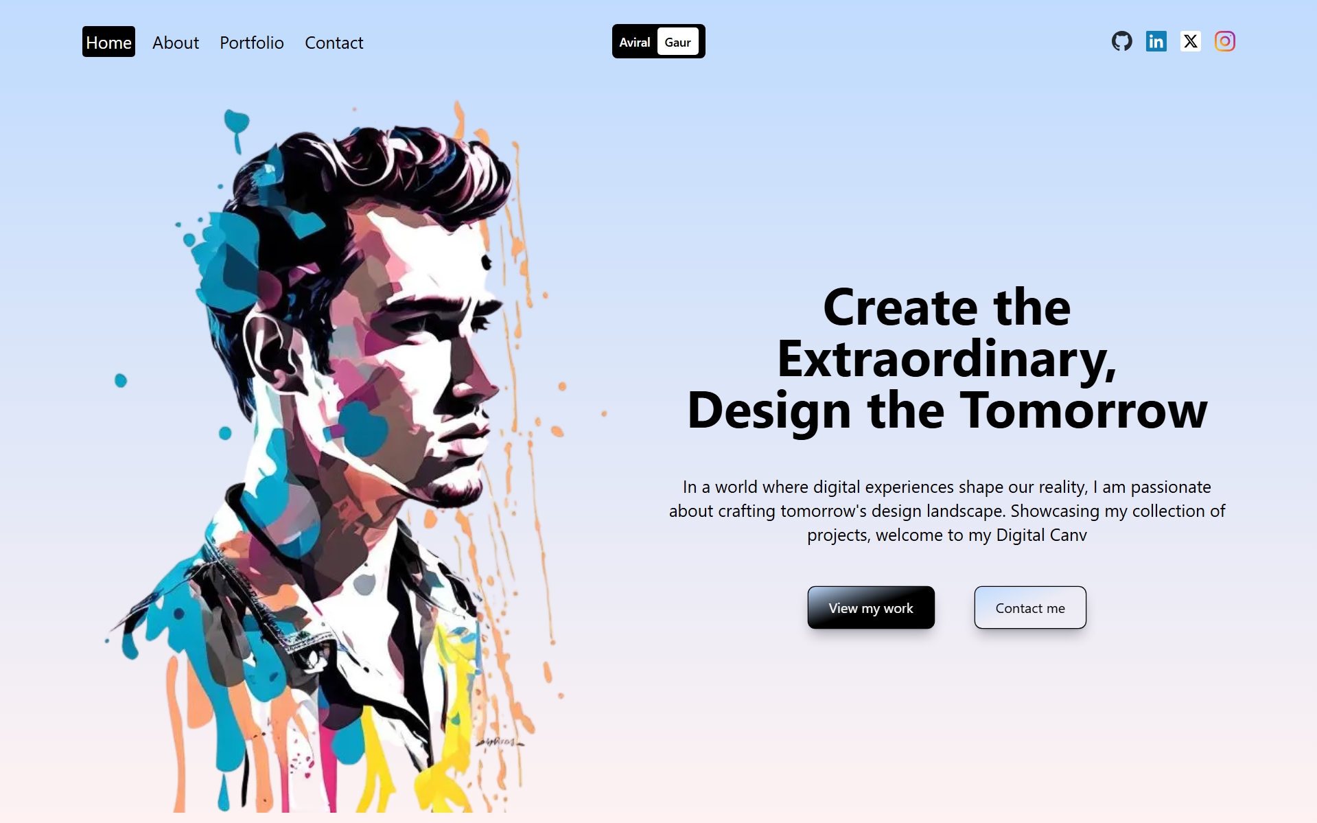
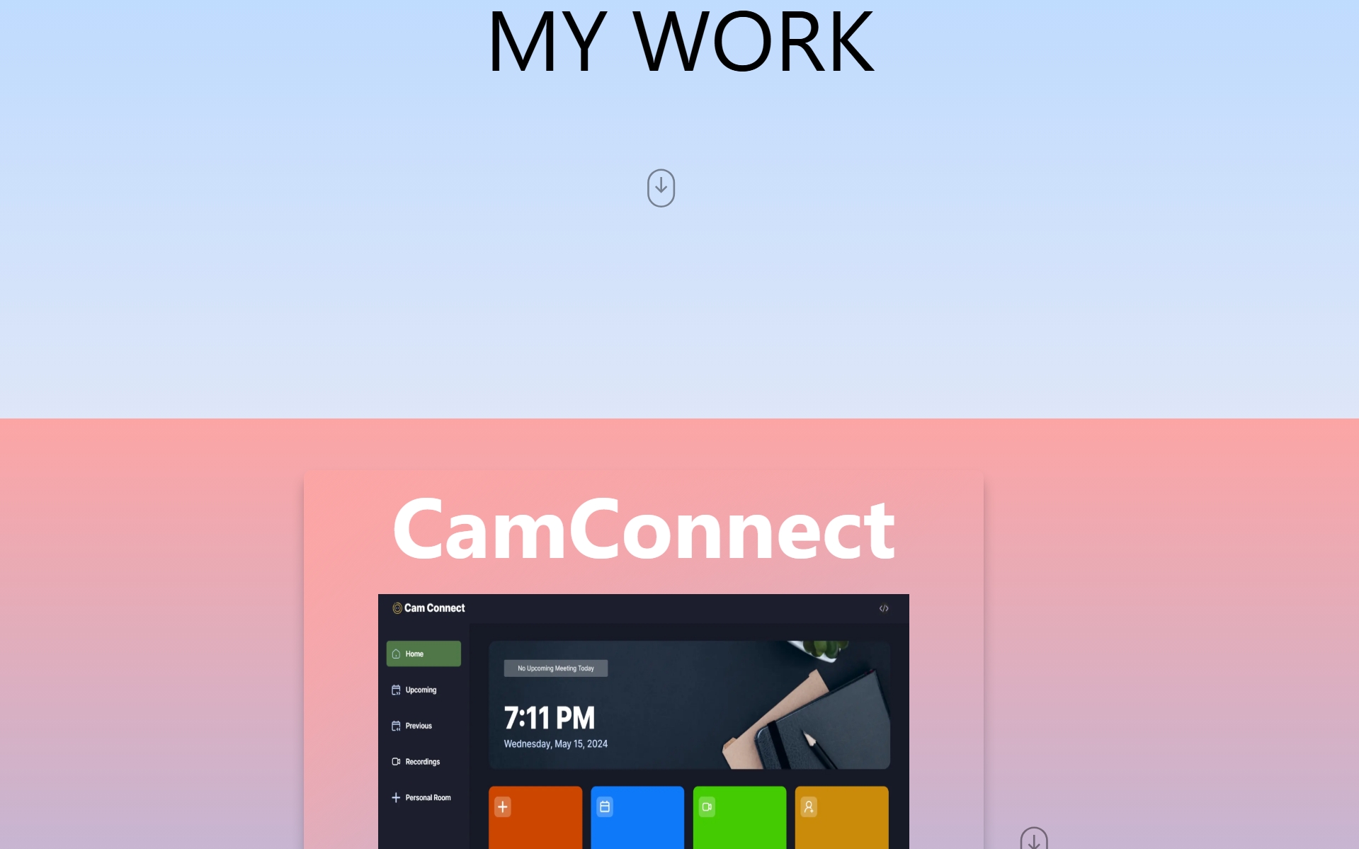
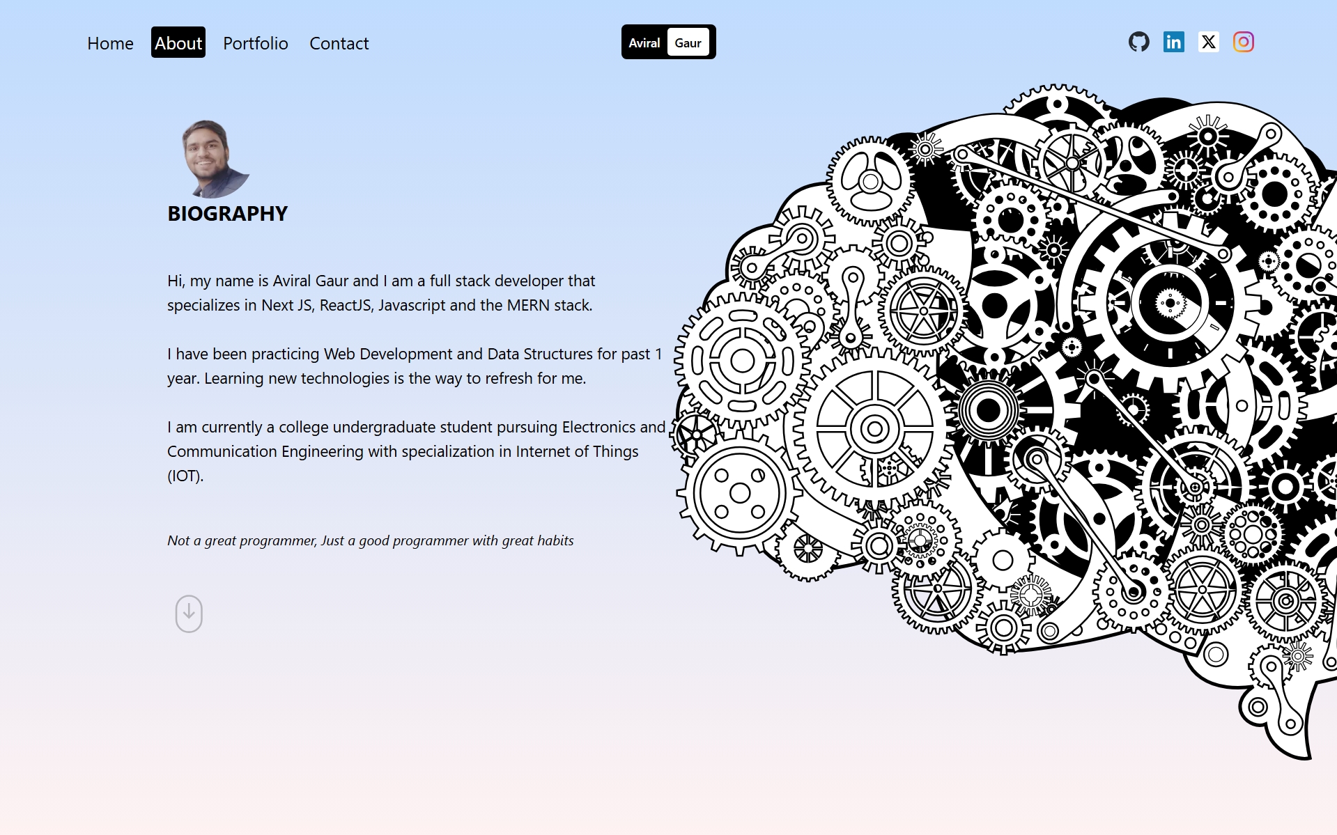
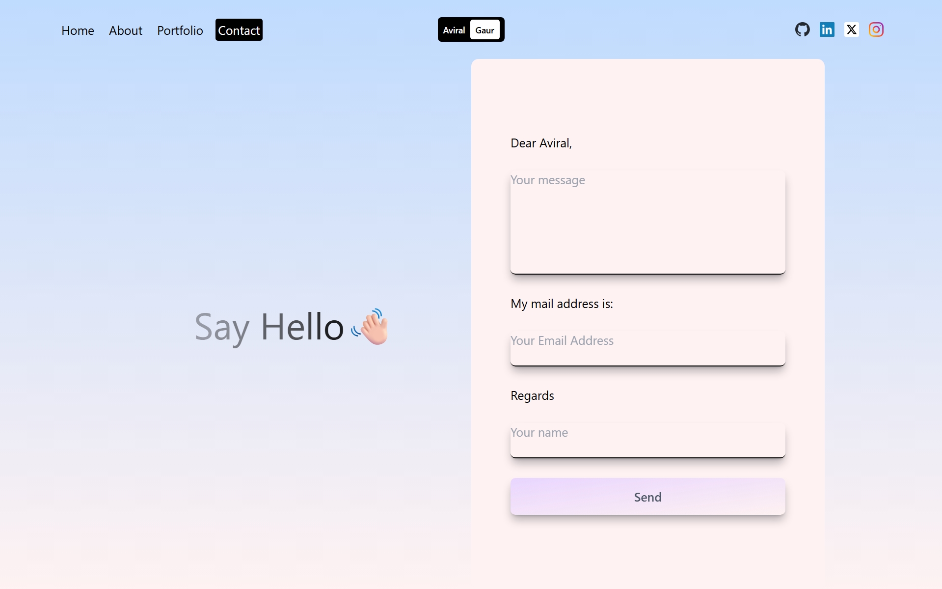
Portfolio v1.0
Deployed First Portfolio
I started working on my first portfolio website. This project was a significant milestone, allowing me to apply my newly acquired skills in a practical setting and showcase my abilities in web development. I focused on creating a responsive and visually appealing interface, ensuring a seamless user experience across various devices. This project not only enhanced my technical skills but also taught me the importance of meticulous planning and iterative development as this was one of the first project I worked on. I tried to integrate several modern web development practices, such as component-based architecture and state management, to ensure the codebase was maintainable and scalable.
Nov'25
Nov'25
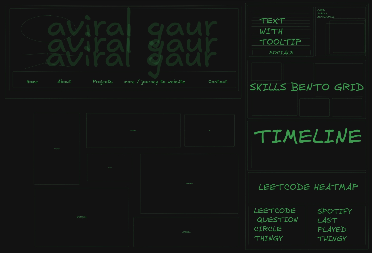
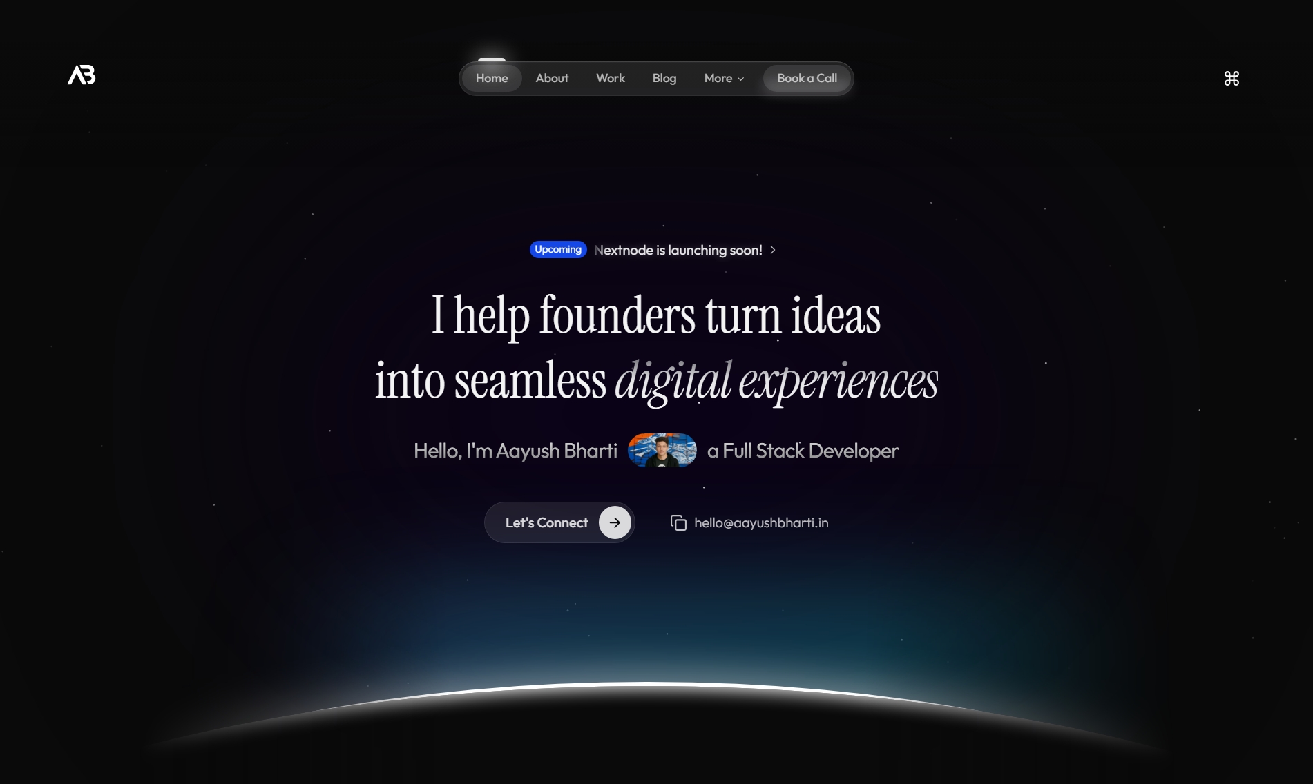
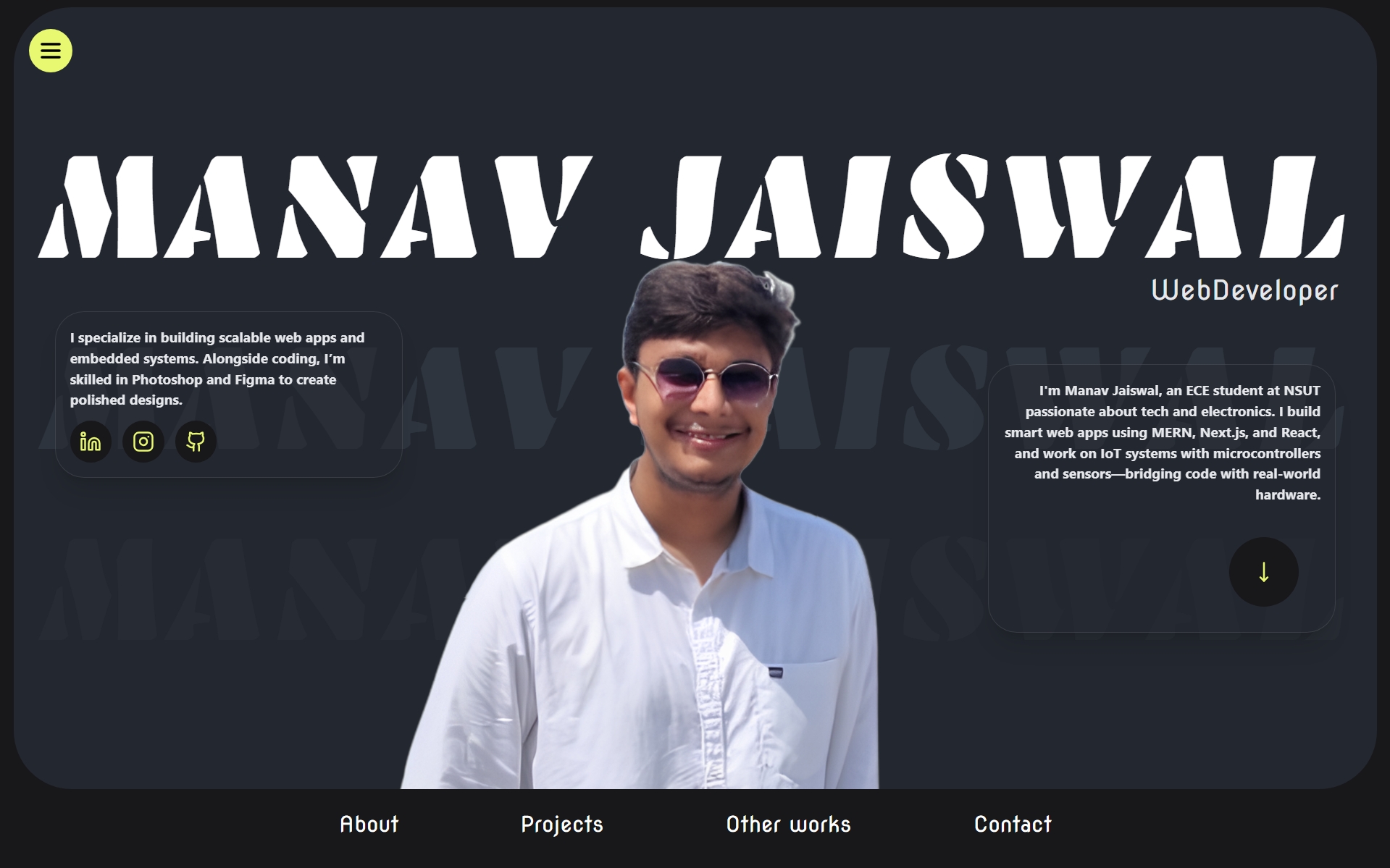
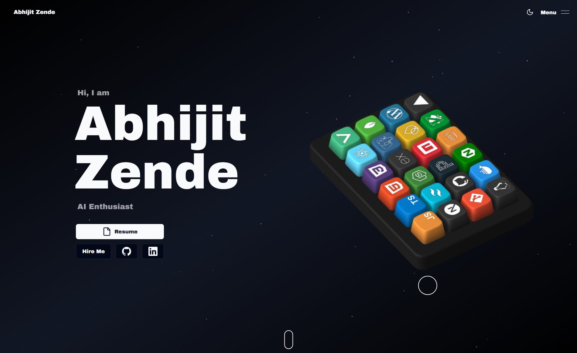
Inspiration and Ideation Phase
Searched the internet for sources of inspiration for the second adaptation of my portfolio.
I spent countless hours exploring various design portfolios, Dribbble shots, and Behance projects. My goal was to gather a diverse range of aesthetics, interactive elements, and user experiences. I meticulously analyzed what made certain designs stand out, paying close attention to typography, color schemes, layout structures, and animation principles. This phase involved a lot of sketching, mood boarding, and conceptualizing how I could blend different inspirations into a cohesive and unique personal brand. I also looked into emerging web technologies and frameworks that could bring my vision to life, ensuring the new portfolio would not only look good but also be performant and maintainable.
Dec'25
Dec'25
Build Phase
Developed and Deployed Portfolio v2.0
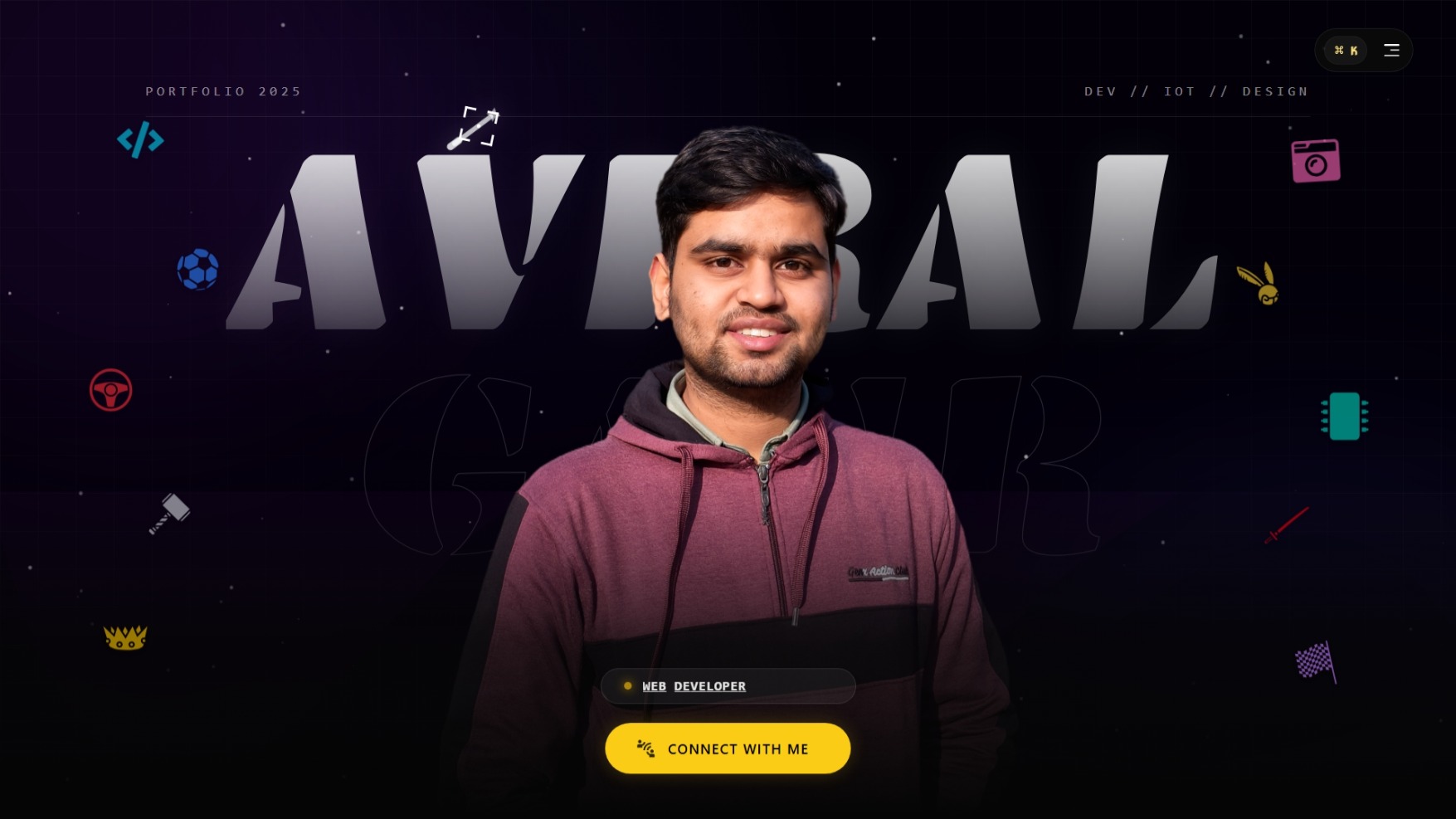
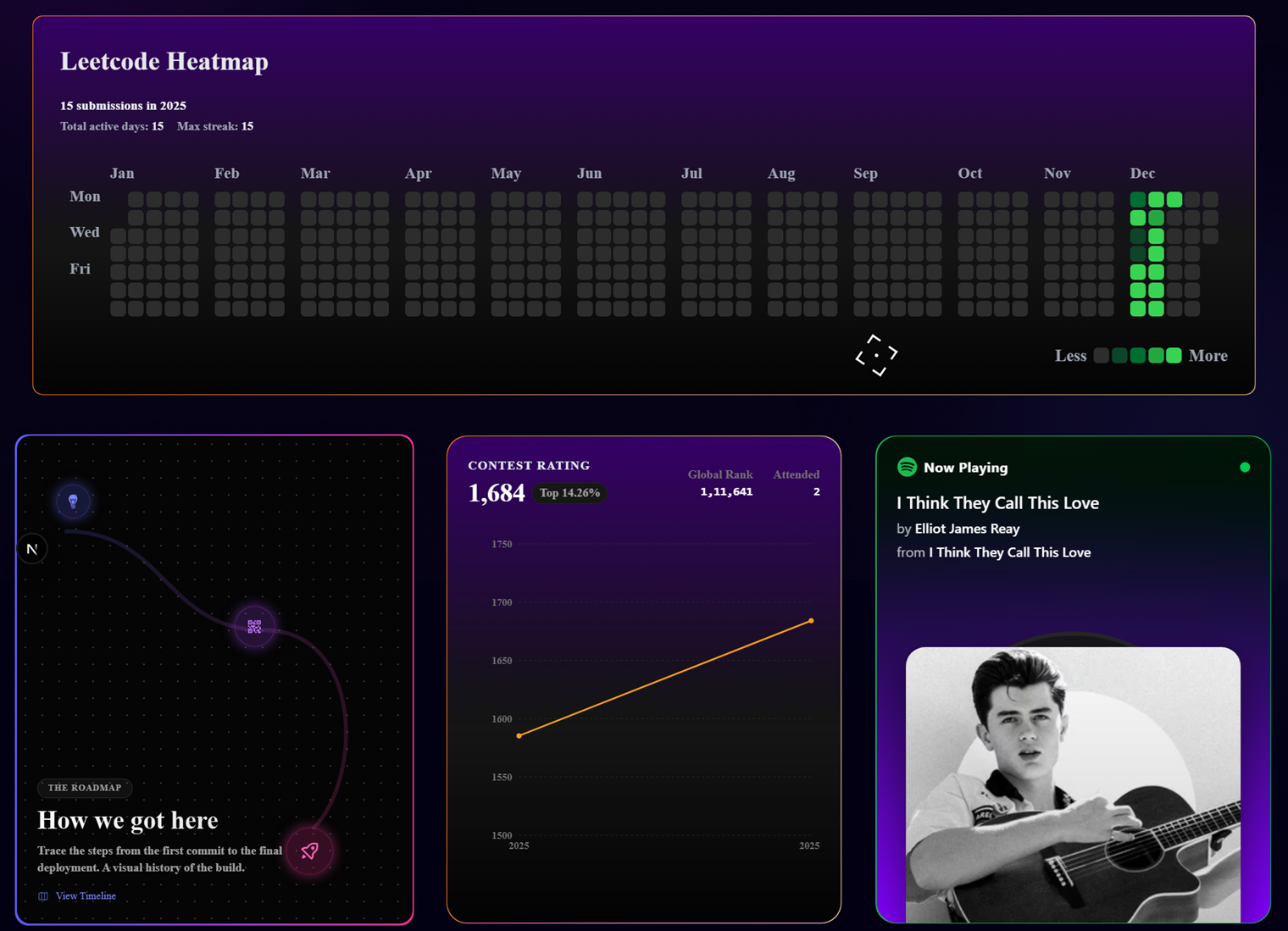
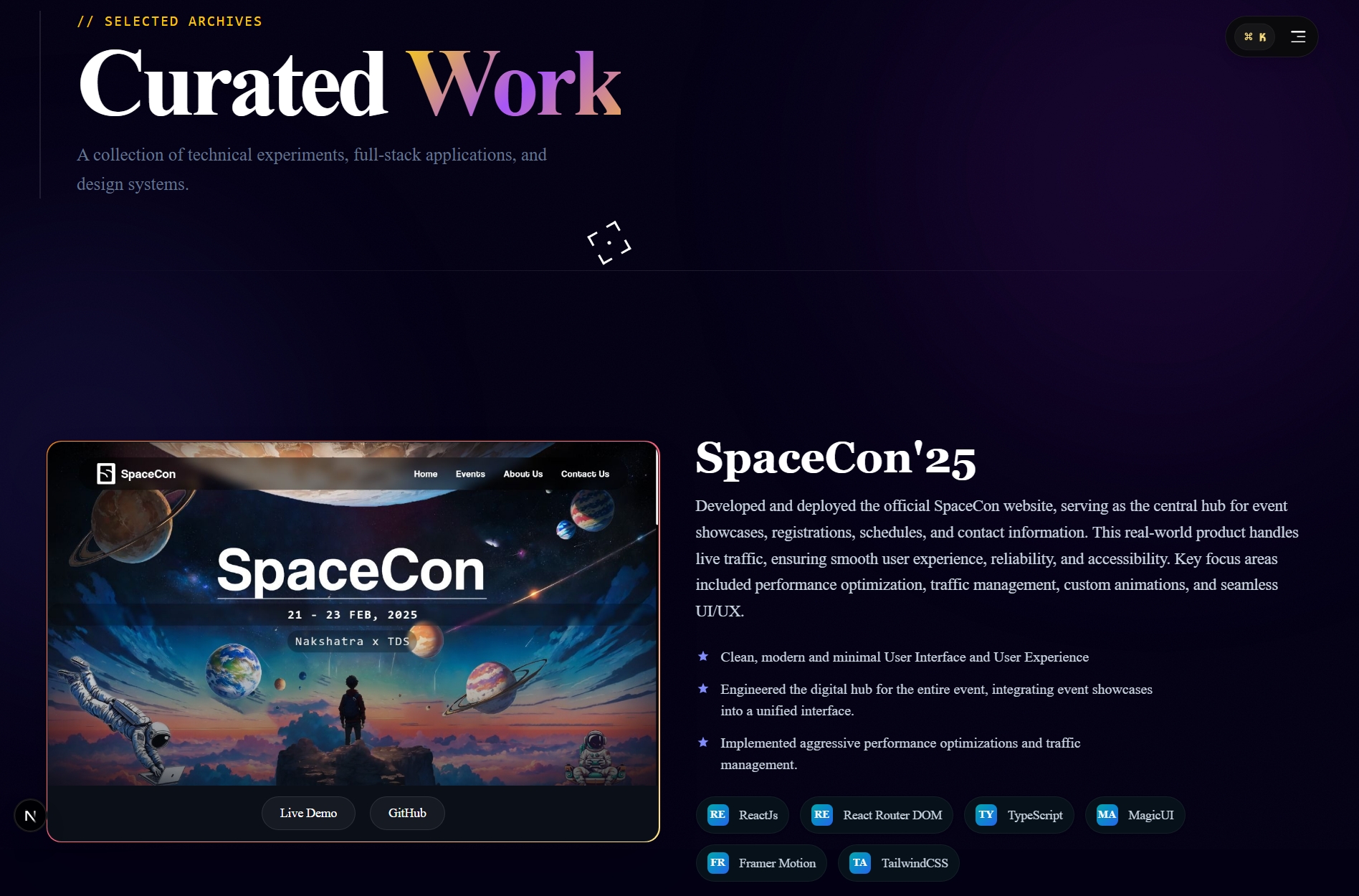
I embarked on the ambitious journey of developing and deploying Portfolio v2.0, a complete overhaul designed to push the boundaries of modern web development. This phase was characterized by intensive coding, meticulous debugging, and a relentless pursuit of performance optimization. I leveraged cutting-edge technologies like Next.js for server-side rendering, TypeScript for robust type safety, and Tailwind CSS for a utility-first styling approach, ensuring a highly scalable and maintainable codebase. The development process involved integrating complex animations with GSAP, crafting responsive layouts for a seamless multi-device experience, and implementing interactive components that elevate user engagement. Every line of code was written with a focus on creating a visually stunning and functionally superior portfolio that truly reflects my growth as a developer.
The Tech Stack
Tools chosen not because they are trendy, but because they provide absolute control.
Next.js
Server-side rendering & SEO mastery.
TypeScript
Zero runtime errors. 100% Type safety.
Tailwind
Utility-first architecture for speed.
GSAP
Cinematic, timeline-based choreography.
Nodemailer
Email sending made easy.
Framer Motion
Declarative animations, fluid interactions.
JWT
JSON Web Tokens for secure authentication.
ReactBits UI
Custom component library for consistent UI/UX.
Built By

Aviral Gaur
Full Stack Arch

Manav Jaiswal
Full Stack Arch